What is a heat map? Heat maps can be seen often online and much more so since COVID-19, so what are they?
Heat maps show concentrations of attributes generally focusing on geographic locations on maps. The value of heat maps is that they provide a quick visualisation of what is happening where and under what conditions depending on the use case and the data points. What does it tell you — not much on its own necessarily for single data attributes, but plenty when combined with other data.
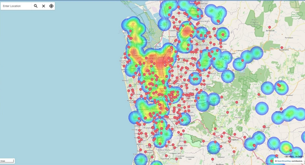
Let’s take the simple example of an area where the core data attribute is registered incidents of industrial pollution or waste contamination.

Whilst this is a high-level view, we could drill down to the point at which we could see each notified incident at its “home” location as a single pin. However what more could be added to this attribute which would provide more insight? In this use case, the red pins represent school locations thereby immediately highlighting the risk of schoolchildren potentially being exposed to contaminants.
Are you getting the (literal) picture? By overlaying and/or filtering various data sets we can easily obtain more insights than by just looking at one core attribute. This is the strength of heat maps in contemporary geospatial solution platforms such as Mapcite.


